Picture this.
You open an AI chat, type a long paragraph describing your dream website, and ten minutes later it's just there. Clean layout. Nice hero section. A pricing table. It even has dark mode.
You deploy it. You feel like a genius. You send the link to a friend on WhatsApp.
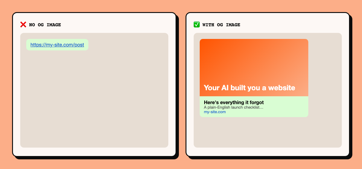
And what shows up is a plain blue link. No image. No title. No description. Just a URL sitting there like it has never met a human before.
Nothing is broken. The site works. The AI did exactly what you asked. The catch is that you asked for a website, and the website itself is maybe 20% of what makes a site ready for the real world.
The other 80% is boring, invisible, and not optional. This post is that list.
Why AI skips all of this#
Three reasons, and none of them are "the AI is dumb".
1. You only describe what you can see. You say "hero section, orange button, pricing table". You don't say "sitemap", because you don't know it exists. The AI builds the thing you described, and that's basically it.
2. Nobody sees these things working. A good 404 page, a sitemap, rate limiting: when they work, nothing happens. There's no wow moment, so nobody puts them in the prompt, and there's nothing in the demo to remind you.
3. The AI is trying to please you right now. Its job in that moment is "make the thing in the prompt look right in the preview". Security headers don't show up in the preview. Neither do secrets you're about to commit to GitHub. And unless you ask, it tends to pick the fastest path to a working screen, not the safest path to a launch.
This isn't a "vibe coding is bad" post. I vibe code too. It's a "know what to ask for" post. Once you know, one prompt fixes most of it, and I've put that prompt at the end.
We'll go in order, from stuff people see to stuff nobody ever sees.
Part 1: What your visitors see#
1. A custom 404 page.
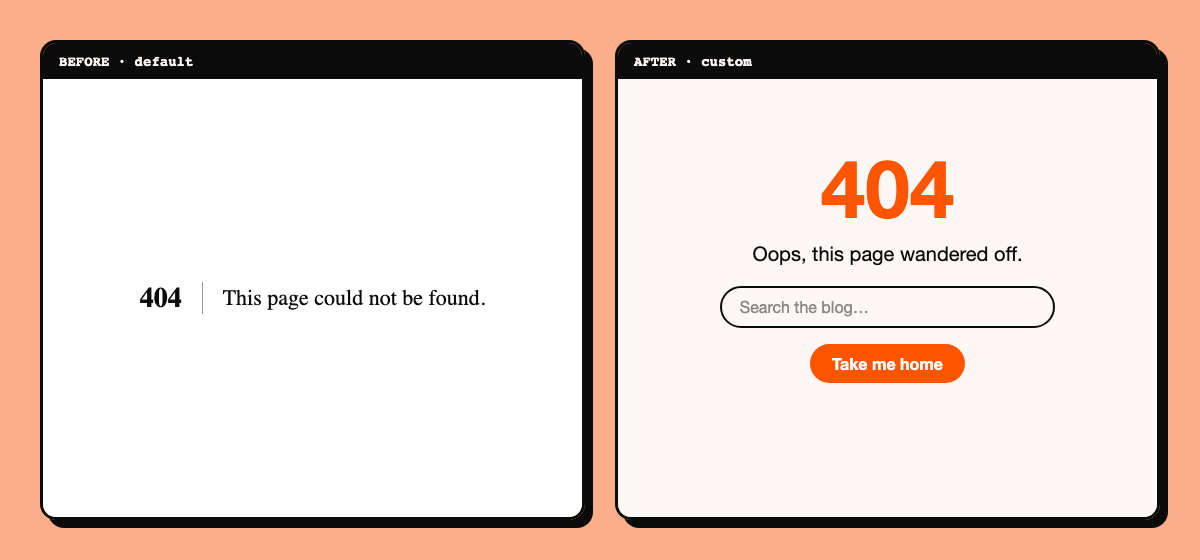
Someone mistypes a URL or clicks an old link. By default they get a stark white page that says "404". Dead end, they leave.
A custom 404 keeps them. Keep your header, say something human, and give them one or two places to go: home, your best content, a search box. People genuinely screenshot good 404 pages.
One technical thing: the page must still return a real 404 status code, not a 200. Otherwise Google may treat every broken URL as a real page.
2. A call to action above the fold.
"Above the fold" means what's visible before anyone scrolls. If a stranger lands on your site and the first screen doesn't say what this is and what to do next, you lose most of them in about five seconds.
One clear sentence. One button. "Book a call." "Read the guide." "Start free." Not five buttons fighting each other.
3. Mobile that actually works.
AI loves building desktop first, and a site that looks perfect on your laptop can be a mess on a phone. Over half your visitors are probably on one.
Check the basics: text readable without pinching, buttons big enough for a thumb, no sideways scrolling, menus that actually open, nothing cut off at the edges.
You don't need ten different phones to test this. The Mobile Simulator Chrome extension lets you preview your site inside different phone and tablet sizes right in the browser. Still open it on your own real phone before launch, because real thumbs and real connections find things a simulator won't.
4. Loading states that feel fast: skeletons, not spinners.
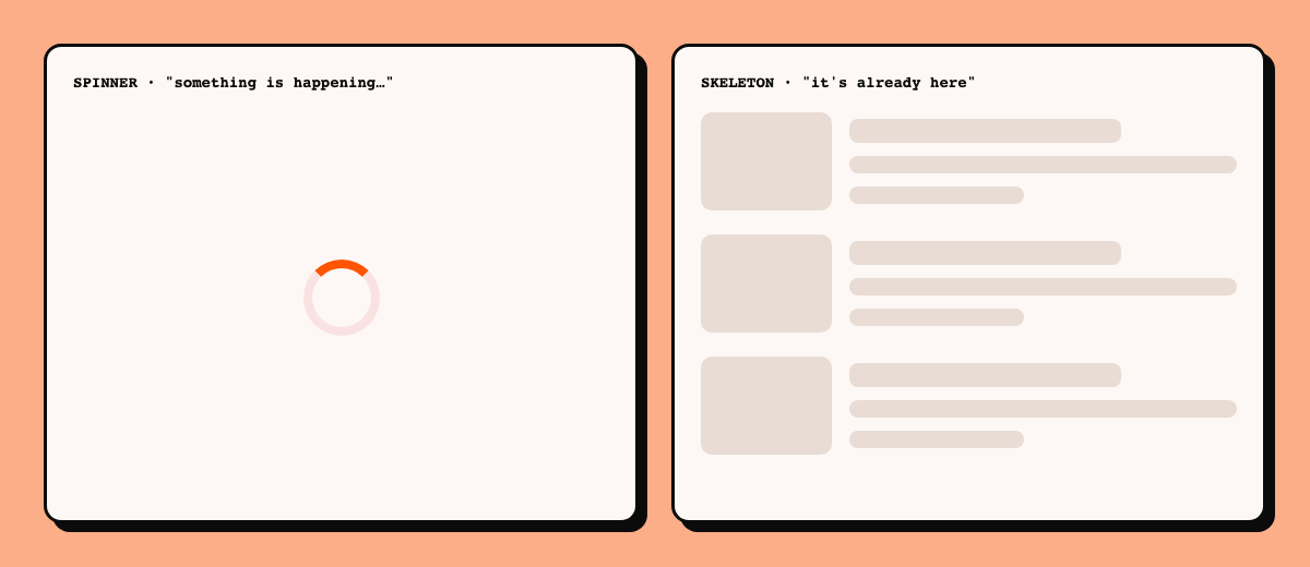
A spinner says "something is happening, please wait." A skeleton says "your content is already here, it's just arriving." Big difference in how it feels.
A skeleton is a grey placeholder shaped like the thing that's about to appear: a card outline, a few fake lines of text, a rectangle where the image goes. Pages feel faster even when they aren't, and the layout doesn't jump around.
Use spinners for tiny things, like a button that's saving. For lists, feeds, dashboards and cards, use skeletons.
5. Empty states and error states.
What does your app show when there's no data yet? What does it show when something fails? AI almost never designs these.
A blank white rectangle looks broken. An empty state says "No projects yet. Create your first one" with a button. An error state says "Something went wrong, try again", not a wall of red code.
Every list, form and fetch needs three versions: loading, empty, failed.
6. A real favicon, and the Apple icon too.
The favicon is the tiny icon in the browser tab, in bookmarks and in search results. Skip it and you get the default globe or the framework logo, which makes a site look unfinished faster than almost anything else for something so small.
The part people forget is the Apple touch icon. When someone on an iPhone or iPad taps "Add to Home Screen", your site becomes an app-like icon on their phone. Without an Apple touch icon, iOS shows an ugly screenshot or a plain letter. With one, you get your logo sitting right next to their real apps. Make it 180 by 180 pixels, a plain square (iOS rounds the corners itself), and name it apple-touch-icon.png.
So you need: a regular favicon.ico, ideally an SVG icon, the 180 by 180 Apple touch icon, and a site.webmanifest so Android can do the same. One free generator that makes all of them from a single image is enough.
7. Friendly error and success messages.
This one is easy to miss because AI makes it look fine in development. When something breaks while you're building, you see the real error: a stack trace, a database message, "500 Internal Server Error". That's useful for you. It's terrible for a visitor, and it can leak details about how your app works.
In production, your users should see plain language that says what happened and what to do next:
- Instead of a raw error: "We couldn't save that. Please try again in a minute."
- After a successful action in a dashboard (saved, deleted, sent): a clear confirmation, like "Post saved" or "Message sent", so people know it worked.
- On failure, keep their typed data in the form, so they don't have to start again.
Log the real error on the server and show the user the friendly one. That way you still get the details. Your host already collects logs (on Vercel, open the Logs tab in your project), and an error tracker like Sentry can notify you when something crashes, so you hear about it before an angry user tells you.
Part 2: What WhatsApp, Google and AI assistants see#
This is the part most beginners never think about, because you never see it yourself.
8. Meta title, meta description and meta tags.
Meta tags are small pieces of information in your page's <head> that visitors never see but Google and social apps read. The two big ones:
- Meta title: the blue clickable headline in Google results, and the text in the browser tab.
- Meta description: the grey snippet under it. It doesn't directly rank you, but a good one decides whether people click.
Other meta tags matter too: canonical, robots, viewport (needed for mobile), and the Open Graph tags in the next item.
Common AI mistake: every page ends up with the exact same title and description. Google then has no idea what each page is about. Give every page its own.
Rule of thumb: meta titles around 50 to 60 characters, descriptions around 150 to 160. Write them for a human, and say what the page gives the reader.
9. Open Graph tags and an OG image. This one is a big deal.
Open Graph is a set of meta tags (og:title, og:description, og:image, og:url) that tell WhatsApp, iMessage, Slack, X, LinkedIn and Discord how to build the preview card when someone pastes your link. The OG image is the picture on that card.
Remember the blank link preview from the start? That's what you get without them. With them, your link turns into a card with a picture, a title and a description. It's the difference between a link people scroll past and a link people tap.
The standard OG image size is 1200 by 630 pixels. Put your title and a bit of branding on it. Even better, generate a unique one per page automatically so every post gets its own preview.
A tip that saves a lot of confusion: social apps cache previews hard. If you fixed your OG image and the old preview still shows up, that's the cache, not you. Use the platform's debugger tool, or add a harmless query string to the URL to test.
10. A sitemap.xml.
A sitemap is a list of all your pages that you hand to search engines. Without one, Google has to discover pages by following links, which is slower and misses things. With one, you're saying "here's everything, please look." Most frameworks can generate it automatically. Ask your AI.
11. A robots.txt.
A small text file at yourdomain.com/robots.txt that tells crawlers what they can and can't visit. It should point to your sitemap and block things like your admin area. Also make sure you didn't accidentally block everything: a Disallow: / left over from development quietly hides your whole site from Google.
This file matters for AI too, and this is the part that's actually documented. OpenAI publishes exactly which crawlers it runs and how robots.txt controls them, in its crawler overview:
- OAI-SearchBot is used to surface sites in ChatGPT's search features. OpenAI recommends allowing it if you want to show up there.
- GPTBot is for training generative AI models. Disallow it and your content shouldn't be used for training.
- ChatGPT-User is for actions a person triggers inside ChatGPT. OpenAI notes that because a user initiated it, robots.txt rules may not apply.
OpenAI also says each setting is independent, so you can allow search and block training, or the other way round. Changes can take around 24 hours to kick in.
12. llms.txt and llms-full.txt. Add these, they matter.
Think of these as a "start here" page for AI. They're two plain markdown files, yourdomain.com/llms.txt and yourdomain.com/llms-full.txt, that explain what your site is and list your best pages in a format a chatbot can read in one go.
llms.txt is the short version: a summary plus links to your important pages. llms-full.txt is the long version: the actual content of your pages in one file. When an AI assistant or agent explores your website, these files let it understand your entire site at a glance, instead of crawling page after page and guessing. The format comes from llmstxt.org.
They're free, they take a few minutes, and AI-driven discovery is only getting bigger, so adding them is really important these days. I use both on this blog.
Pair them with the robots.txt rules above, and follow OpenAI's crawler guidelines: they explain how OAI-SearchBot, GPTBot and ChatGPT-User behave and how to control each one. Read them here: OpenAI crawler docs.
13. Structured data.
Structured data (JSON-LD) is a hidden snippet that tells search engines exactly what a page is: an article, a product, a business, a person. It can unlock richer results in Google. It's a bit more advanced, so do it after everything else, and test it with Google's Rich Results Test.
14. Canonical URLs and one version of your domain.
Your site can accidentally exist at four addresses: with and without www, with http and https. To Google that can look like duplicate content. Pick one, redirect the rest to it, and add a canonical tag on each page pointing at the official URL.
Part 3: Speed#
15. Images are probably your biggest problem.
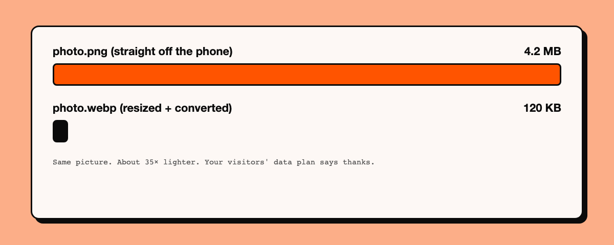
Here's a thing nobody warns you about. An image straight off a phone or a design tool can be 4 MB, 20 MB, sometimes 200 MB. Put ten of those on a page and you've built a site that takes forever on a normal connection.
The fix isn't "be careful with images". The fix is a pipeline, so you never have to think about it again:
- When an image is uploaded, resize it to the largest size it will ever be displayed at. Nobody needs a 6000 pixel photo in a 600 pixel box.
- Convert it to WebP (or AVIF). Same picture, a fraction of the size.
- Serve the converted version, never the original.
- Lazy load anything below the fold so it only loads when someone scrolls near it.
- Always set width and height so the page doesn't jump while images load.
Do this once and you'll never ship a 200 MB image again.
16. Core Web Vitals and Lighthouse.
Google measures real user experience with three numbers: how fast your main content appears (LCP), how quickly the page reacts when someone taps (INP), and how much the layout jumps around (CLS). Roughly, aim for LCP under 2.5 seconds, INP under 200 milliseconds, and CLS under 0.1.
You don't have to calculate any of it. Open your site in Chrome, open DevTools, go to the Lighthouse tab and run a report (Lighthouse docs), or just paste your URL into PageSpeed Insights. You get scores out of 100 for performance, accessibility, best practices and SEO, plus a list of exactly what to fix. Test the live site, not localhost, and use mobile mode. It's the closest thing to a free professional audit that exists.
Part 4: Knowing what's happening#
17. Google Search Console and Bing Webmaster Tools.
Deploying on Vercel or Netlify doesn't tell Google you exist. Add your site to Google Search Console, verify it, and submit your sitemap. Do the same in Bing Webmaster Tools, which can import everything from Search Console in a couple of clicks. Bing matters more than people think, since several AI assistants and search tools lean on its index.
You get to see how much of your website is actually indexed, which searches bring people to you, and which pages have problems. It's free, and it's the only way to find out why a page isn't showing up.
18. Analytics.
You can't improve what you can't see. You need to know how many people visit, where they come from and what they read. Two tools, two different jobs:
- Google Analytics is the common one. Create a property, grab your Measurement ID (it looks like
G-XXXXXXXXXX), and paste it into a small script on your site. That's it, your website is ready to be measured. Ask your AI to add it with your ID. - Microsoft Clarity is free and records anonymized sessions, so you can literally watch how people use your site, with click heatmaps on top. It's the fastest way to find out your button is invisible on mobile. Same idea: create a project, add its small script, done.
Search Console tells you how people find you. Google Analytics tells you what they do. Clarity shows you where they struggle.
Part 5: The scary stuff#
19. Never commit your secrets.
If I could make every vibe coder read one section, it would be this one.
API keys, database URLs, payment keys, tokens: these go in an environment file (usually .env.local), and that file must be listed in .gitignore so it never reaches GitHub. Bots scan GitHub constantly for leaked keys, and it can take minutes, not days, for a leaked key to get abused.
Three things to check:
.env*is in your.gitignore, andgit statusdoesn't list your env file.- In frameworks like Next.js, anything starting with
NEXT_PUBLIC_is sent to the browser. Never put a secret in one of those. - If a key was ever committed, deleting it later isn't enough, because it stays in your git history. Rotate it: make a new key and revoke the old one.
Also keep an .env.example with the variable names but no real values, so you remember what the project needs.
20. Rate limiting.
Rate limiting means capping how many requests one visitor can make in a given time. Without it, a bot (or one very annoyed person) can hammer your contact form, your login page or your AI feature.
That last one hurts. If your site calls a paid AI API, an unprotected endpoint is an open tap on your wallet, and someone can burn through your credits overnight. Rate limit every public endpoint, login attempts, signups and anything that costs you money, and set a spending cap with your API provider as a second safety net.
Easy ways to do it: Upstash Ratelimit is a tiny library that works great on serverless, Vercel's WAF rate limiting needs no code if you're hosted there, and Cloudflare rate limiting rules work in front of any host.
21. Forms that don't break.
Forms are where AI builds look finished and aren't. A good form has:
- Validation on the server, not just in the browser (browser checks can be bypassed)
- Spam protection: a hidden honeypot field or a captcha like Cloudflare Turnstile
- A clear confirmation after sending, so the user knows it worked
- Proper labels on every field
- Somewhere for the messages to actually go, and a way for you to know they arrived
22. Backups.
What happens if your database vanishes tomorrow? Check what backup or point-in-time restore your provider offers on your plan and how far back it goes. If it's not enough, schedule your own exports. A backup you've never tested is a hope, not a backup.
Part 6: The legal and trust stuff#
23. A privacy policy that's actually yours.
If you collect anything at all (analytics, a contact form, a newsletter signup), you need a privacy policy. But here's the catch: AI will happily generate a random, generic one that doesn't match your site. A policy that says things you don't actually do is worse than useless.
Yours should be specific. Say clearly:
- What you collect: analytics data (Google Analytics, Microsoft Clarity), whatever your forms collect (name, email, message), newsletter signups, cookies.
- Why you collect it, and who else sees it: Google, your host, your email provider.
- How long you keep it, and how people can ask you to delete it. Add a contact email.
- Children's data. State whether your site is meant for children. If you don't knowingly collect data from kids, say so, and know what you'll do if it happens.
- Your country's rules. Laws differ. In India, the Digital Personal Data Protection (DPDP) Act, 2023 and its 2025 rules require verifiable parental consent before processing the data of anyone under 18, with some exemptions (summary). In the US, COPPA covers children under 13. The EU and UK have GDPR and their own rules.
This isn't legal advice. Check the law where your audience lives, and re-read what your AI wrote against what your site really does.
24. Cookie consent. Really, really important.
If you have visitors in the EU or UK and you use analytics or tracking cookies, the cookie banner isn't decoration. The law expects explicit consent, and getting this wrong can get you in real trouble.
What "explicit" means in practice:
- Not auto-agreed. No "by continuing to use this site you accept cookies", and no pre-ticked boxes. Staying silent doesn't count as yes. The UK's ICO says this plainly in its PECR guidance.
- Track only after the user agrees. Google Analytics and Clarity scripts must not run until the visitor clicks accept. Not "load first, ask later".
- Say what you're asking for, in the banner itself, in plain words.
- Saying no is as easy as saying yes. Put a Reject button next to Accept.
Pick a consent tool that really blocks your scripts until the user agrees, such as the open-source CookieConsent, and test it: open your site, decline, and check that nothing tracks you. Rules vary by country, so check where your audience lives.
25. Email that doesn't land in spam.
If you send email from your own domain (contact replies, newsletters), set up SPF, DKIM and DMARC records. They prove that mail claiming to be from you really is. Skip them and your emails quietly go to spam.
And if you're building a product with a marketing email campaign, send it from a subdomain, like mail.yourdomain.com, not your main domain. If a campaign ever gets flagged as spam, the damage stays on the subdomain and your main website and everyday email don't get hurt. It's standard practice.
Your copy-paste prompt#
Already built your site and want all of this fixed? Paste the prompt below into your AI coding tool (Claude Code, Cursor, whatever you use) from inside your project. It audits first and asks before changing anything big. Hit Copy prompt and it's on your clipboard, no need to read the whole thing (you can expand it if you're curious).
Copy-paste prompt: pre-launch audit
You are a senior web engineer doing a pre-launch audit of this project. Do NOT start rewriting things blindly. Work in this order and report back at each stage.

STEP 1: AUDIT (read-only)
Inspect the project and tell me which of these are missing, broken or incomplete. Use a checklist with Done / Missing / Partial for each item:

Visitor-facing:
- Custom 404 page (and confirm it returns a real 404 status code)
- Clear call to action above the fold on the home page
- Mobile responsiveness (check for horizontal scroll, tiny tap targets, unreadable text)
- Loading states: skeleton loaders for lists, cards and dashboards instead of spinners
- Empty states and error states for every list, form and data fetch
- Favicon set: favicon.ico, SVG icon, apple-touch-icon (180x180), web manifest
- Friendly error and success messages: no raw errors or stack traces shown to users, real errors logged server-side, clear confirmations after actions, form data kept on failure

Search and sharing:
- Unique meta title and meta description on every page
- Open Graph and Twitter card tags on every page, with a 1200x630 OG image (ideally generated per page)
- sitemap.xml and robots.txt (robots must reference the sitemap and must not accidentally block the whole site)
- robots.txt rules for AI crawlers (OAI-SearchBot, GPTBot, ChatGPT-User, ClaudeBot, etc.): ask me which I want to allow
- llms.txt and llms-full.txt
- JSON-LD structured data where it fits (Organization, WebSite, Article, etc.)
- Canonical URLs, a single preferred domain, and redirects from the alternates (www/non-www, http/https)

Performance:
- Image pipeline: resize, convert to WebP/AVIF, lazy loading below the fold, explicit width and height
- Likely Core Web Vitals problems (LCP, INP, CLS)

Security and reliability:
- Secrets: confirm .env* files are in .gitignore, that no secret is committed or present in git history, that no secret uses a client-exposed prefix like NEXT_PUBLIC_, and that .env.example exists with names only
- Rate limiting on every public endpoint: login, signup, contact form, anything that calls a paid API
- Server-side validation and spam protection (honeypot or captcha) on all forms, with clear success and error messages
- Error tracking and logging (ask me which tool, e.g. Sentry)
- Security headers
- Backup plan for the database

Trust and compliance:
- Privacy policy that matches what the site really collects (analytics, forms, cookies, children's data). Ask me which country my audience is in
- Cookie consent for EU/UK visitors: nothing non-essential loads before explicit opt-in, no pre-ticked boxes, reject as easy as accept

Analytics and visibility:
- Analytics installed (ask me which: Google Analytics or other)
- Microsoft Clarity installed (optional, ask me)
- A reminder list of what I must do manually: verify the site in Google Search Console and Bing Webmaster Tools, submit the sitemap, set up SPF/DKIM/DMARC for my domain email

STEP 2: PLAN
Give me a prioritized fix list grouped as: Critical (security, secrets, rate limiting), Important (SEO, sharing, performance), Nice to have. Ask me any questions you need answered (domain name, brand colors, analytics choice, contact email, where forms should send messages).

STEP 3: FIX
After I approve the plan, implement the fixes one group at a time. After each group, summarize what changed and how I can verify it. Keep the existing design and code style. Do not install heavy dependencies when a small solution exists. Never print, log or commit any secret value.

STEP 4: VERIFY
Run the production build and fix any errors. Tell me how to run a Lighthouse test on the deployed site (mobile mode) and what scores to aim for. List anything that still needs manual action from me.

Rules: be honest about anything you are unsure of, do not invent features, and never claim something is fixed without checking it.
If your AI gets chatty and starts fixing everything at once, tell it to go back to Step 1 and wait for your approval. Audit first, fix later: that order is the whole point.
The cheat sheet#
Screenshot this one.
| Area | Must have | Quick test |
|---|---|---|
| Visitors | Custom 404, CTA above the fold, mobile layout, skeletons, empty and error states, favicon + Apple icon, friendly messages | Mistype a URL. Open on your phone |
| Sharing | Meta title, description and tags per page, OG image, canonical URLs | Paste your link into WhatsApp |
| Search | sitemap.xml, robots.txt, llms.txt, structured data | Open /sitemap.xml and /robots.txt in a browser |
| Speed | WebP images, lazy loading | Run Lighthouse in mobile mode |
| Visibility | Search Console, Bing Webmaster Tools, analytics, Clarity | Check data appears after a day or two |
| Safety | Secrets out of git, rate limits, form validation, backups | Run git status. Hit your form 50 times |
| Trust | Specific privacy policy, cookie consent, email subdomain + SPF/DKIM/DMARC | Decline cookies and check nothing tracks you |
Do this today#
You don't have to fix 25 things this week. Do these three first:
- Paste your site link into WhatsApp and see what happens. If it's blank, add an OG image.
- Run
git statusand check your.gitignore. Make sure no secrets are going anywhere. - Run Lighthouse on your live site and fix the top two things it complains about.
Then work through the rest at your own pace.
AI is an incredible tool, but it builds what you describe and nothing more. Now you know what to describe.
If this helped, send it to the friend who just deployed their first vibe-coded site. They need it more than they know.